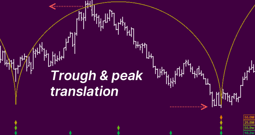
Trough and peak translation
How time displacement of peaks and troughs helps us gauge underlying trend...
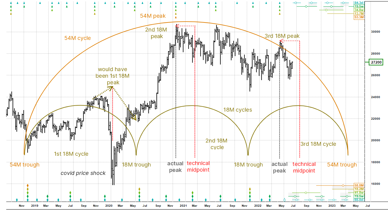
The 54 month cycle has a harmonic ratio of 3:1 with its next shorter neighbour, the 18 month cycle. We are going to focus in on the peaks of the second and third 18 month cycles in the set. After that we will take a look at the peak of the first 18 month cycle. We will also consider an anomaly there, because although slightly off topic, it is instructive.
The average wavelength of the 18 month cycle is 18.2 months (bottom right of chart). The second nominal 18 month cycle came in slightly longer than average at 19.2 months or 588 days. The start point was August 2020 and the theoretical peak should have occurred halfway through at 294 days - the end of May 2021 (the red line at the centre of the second 18M semi-circle). However, the actual peak occurred some 90 days earlier at 204 days (grey vertical "actual peak" line). In other words the 18 month cycle peaked just 34.7% along its full estimated trajectory.
This is called peak left translation. The peak is dragged back in time from its theoretical cycle centreline because the underlying trend has shifted down. The underlying trend here is basically the 54 month cycle which had peaked and was therefore heading down and acting as headwind to the 18 month cycle. The orange triangle at the top of the chart marks the 54 month cycle peak stack.
We also see peak left translation clearly in the third nominal 18 month cycle, which peaked early at the end of August 2022 at just 29% of its anticipated wavelength. This is even more pronounced than the second cycle (34.7%) and implies that the downtrend is accelerating. You would expect this as the 54 month cycle moves forward in time.
The "theoretical" peak of the first 18 month cycle was at the end of April 2020. This peak, in contrast to the other two peaks, occurred 78.3% along its full trajectory (i.e. late) and is an example of peak right translation. The peak is pushed to the right when the underlying trend is up and in this case the 54 month cycle had just bottomed and was acting as a strong tailwind.
When we have an exogenous price shock that takes the market (and the cycles) by surprise, we often see a disruption to the cycle - in this case a big trough occurred where the peak should have happened. The Covid event of 2020 is a good example, but as soon as it was "priced in" the 18 month cycle picked up its rhythm again.
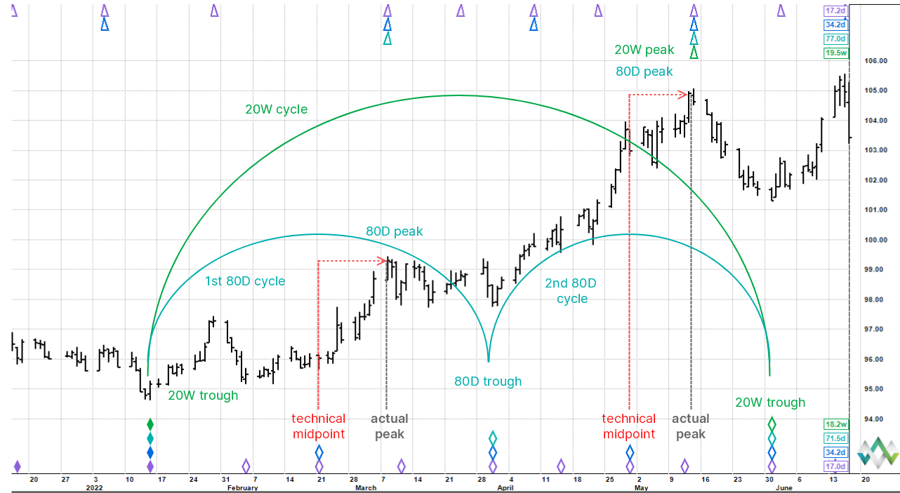
The chart above is an example of peak right translation. We know that the longer cycles underlying the 20 week cycle must be pointing up, because the 20 week cycle peak occurred in mid-May at 87% of the full trajectory, because the broad movement is up and we are posting higher lows and peaks. We saw in the previous example that underlying downtrend dragged the peaks back in time - peak left translation - and here we see the opposite, the peaks are pushed forward in time because of an underlying uptrend.
How does this information help us derive a roadmap at the right edge of the chart? We assume a trough is coming because the 20 week cycle has peaked, but we can further assume that the downswing will be short-lived and that the uptrend should resume in style, which it did.
The next shorter cycle, the 80 day cycle peaks are also pushed forward in time, because as above so below. If the 20 week cycle's underlying trend is up it follows that the same applies to the shorter constituent cycles. The chart shows the technical cycle mid-points compared to the actual peak timings: both 80 day cycles are exhibiting robust peak right translation.
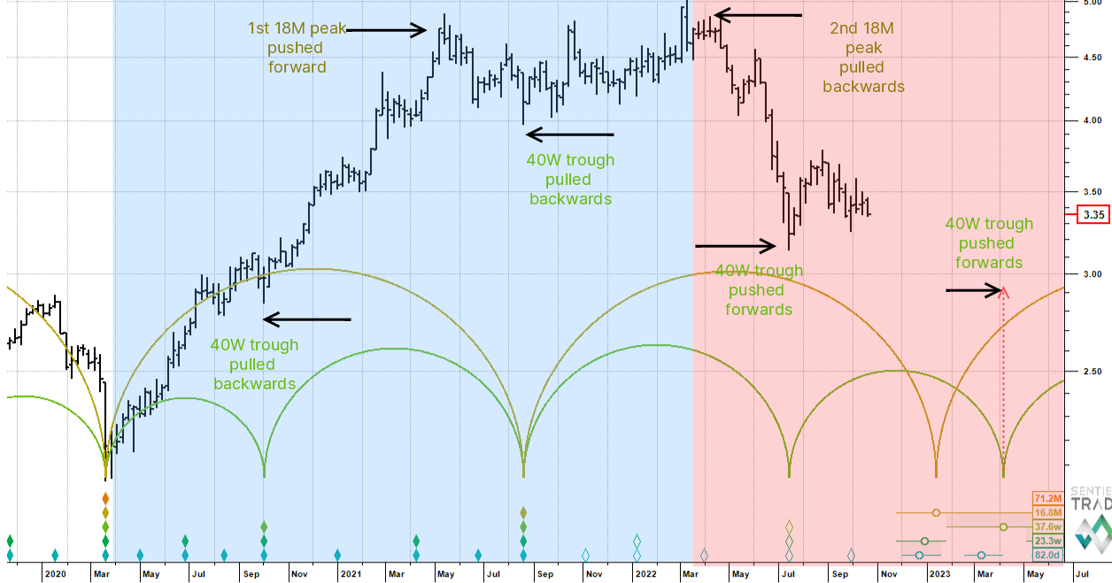
We have looked at peak translation - peaks are pushed forward in time during uptrends and are pulled backwards in downtrends. There is also trough translation, which works in the same way, but in the opposite direction.
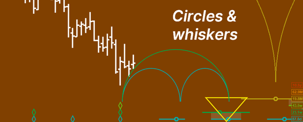
Where there is an underlying uptrend (the blue side of the chart) troughs are drawn back in time and come in early as the uptrend starts reasserting itself. Where there is an underlying downtrend (the red side of the chart) troughs are pushed forward in time and come in late as down pressure leans in on price.
It is useful to bear this in mind. For example, if we look at the 18 month cycle trough expected early next January according the software's trough analysis or phasing, we can see that the 40 week cycle trough is displaced into March, creating overlapping semi-circles. The 40 week cycle trough is being pushed forward, but the circle standing in for the trough is still within the whiskers of the 18 month cycle. So right now, we don't know the exact time location, but expect it to be later than we would think.
Summary:
- Troughs and peaks are displaced from their theoretical time locations by underlying trend,
- In an uptrend we expect peaks to occur late and troughs to occur early,
- Conversely, in a downtrend we expect peaks to occur early and troughs to occur late.
